Over the years, web design has become something just as simple as it’s complicated. While people put all sorts of bells and whistles on their web pages in the past, nowadays, that practice is much less common.
The advent of clean and easy-to-understand websites put an end to the busy websites of yesteryear, ushering in a new era of some of the best website design practices. Even today, those web practices are evolving faster than we think. It’s not just about designing clean and intuitive websites anymore. It’s more than that.
The Advent of Mobile
According to 2013 Pew Internet statistics, ’63 percent of adult cell phone (smartphone) users use their phones to go online exclusively.’ Sixty-four percent of cell phone Internet users go online primarily using their phones, without using other devices like a desktop and laptop computer.
These statistics point to one thing: people are simply going online using their mobile devices more frequently. Throughout the past few years, people have been using their mobile devices for regular web browsing, though nowadays, that activity is becoming more frequent.
The frequency of people using mobile devices to browse the Internet means that web design has to start accommodating these users. Responsive web design was created to address the growing need for a more optimized mobile web.
The Responsive Web
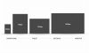
Responsive web design is an approach to building websites that can provide an optimal viewing experience on any device.
This optimal viewing experience generally includes making a mobile website easy to read and navigate without frequent resizing, scrolling, and panning. Responsive web design’s primary goal is simply designing a site easily viewed across various devices, whether through mobile devices or desktop computer monitors.
Sites designed using responsive web design principles actively re-adapt website layouts to the device where users see the website. Many responsive websites use what’s known as flexible pictures, CSS3 media queries, and proportion-based grids to foster a wholly responsive environment.
To go into detail about these concepts:
- Fluid grids, in responsive design, keep the page element sizing in relative units (percentages) instead of absolute units (pixels or points).
- Flexible images are sized in relative units, something that helps prevent them from displaying outside their corresponding container element.
- Media queries let pages use different CSS style rules, generally based on pre-established characteristics about the device where the site’s being displayed; these traits commonly include the width of its corresponding browser.
Many web developers and designers generally work with responsive designs on a server-side rather than a client-side basis (via a device).
These responsive server-side components (RESS) can help faster loading websites over primarily cellular networks, presenting better usability and richer functionality over various devices.
Designing For A Responsive Web
A few years ago, even the best website design firms didn’t immediately design responsively for their client websites. Not everyone was using the mobile web to its fullest potential so that naturally meant that newer web design practices weren’t yet needed. Nowadays, that couldn’t be any more different.
Today’s web needs responsive design. Too many people now hop onto their mobile devices after using their desktops or laptops to browse the web. Too many people also use the mobile web as their only means of accessing it. Thanks to this phenomenon, it’s crucial for web developers and designers to get more acquainted with responsive web design.
Today’s responsive web design provides complete user experiences across near-infinite screen sizes and a selection of resolutions. Due to that, web designers and developers no longer have to develop separate mobile versions for client websites. They only have to design one responsive website that will adjust to fit its resolution when viewed on any device.
More Than Just Resolution
Though responsive web design is more than just ensuring a website works to fit the resolution of any mobile device, let alone any device. It’s also about ensuring that all website elements fit together in a meaningful and, most importantly, easy-to-understand way for end users.
For example, many web designers and developers may add content at the last moment rather than implement content after the initial design concept is finished. Content is essential when it comes to the best website design practices, as it can shape the entirety of the site itself. The content will be why end users visit your site, so keeping that in mind is essential.
Presenting the content in a responsive website design helps you and the designer/developer understand how your site will react to different resolutions when the content’s already in place. This can essentially help ‘nail’ a good website design—functional and practical for any end user, whether browsing from the mobile web or a desktop computer.